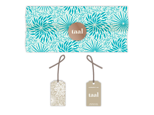
Taal
Art Direction & Design Collaboration: Pharaon Siraj
Brand identity for Taal, a new line of jewelry hand-crafted in the Philippines.
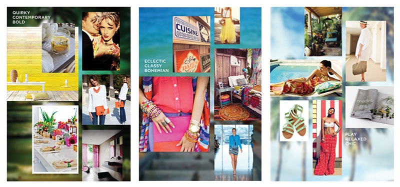
The process started with research and creating mood boards to get a better feel of the style that the brand should have and the image it should project. Different concepts were sketched out and then further developed.
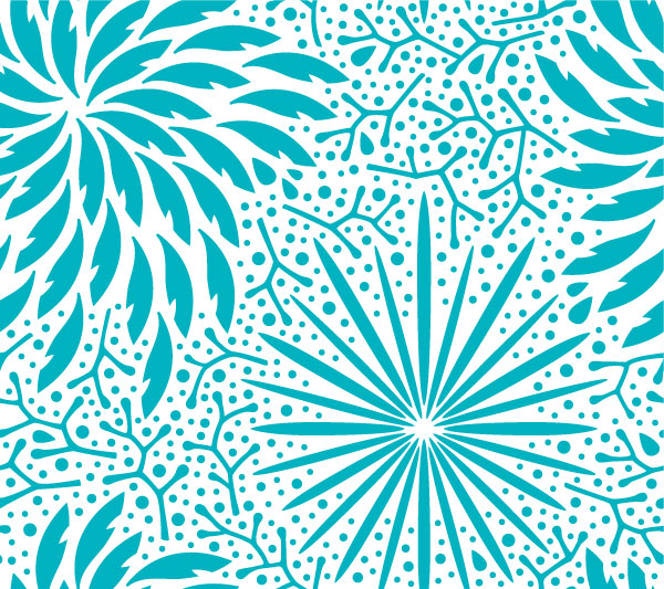
Each necklace is a one-of-a-kind statement piece created from locally sourced natural materials like wood, coconut shells and buri seeds. Naturally, tropical coastal plants and colors, as well as the notion of the handmade, were an important source of inspiration in the design.
Proposed packaging applications include tissue wrapper printed with the pattern, and kraft paper tags.