Will to Live
Client: Digital Third Coast/Aperion Care
Infographic looking at 50 inventions through time that have made, or will make, a positive impact on human life expectancy.

The objective was to display the inventions against time of invention and the number of lives saved, for comparison and the potential to identify trends. The huge differences between the values (a few hundred thousand versus one billion on the two ends) and dimensional constraints proved to be the main challenges, as was the need to highlight newer inventions that only have per-year rates instead of accumulated numbers.
After an initial trial of different layout ideas, the consensus was that a polar area chart would make the most efficient use of space and be visually intriguing at the same time. Categorizing and color-coding the inventions also add another layer to the information and allow trends to be identified.
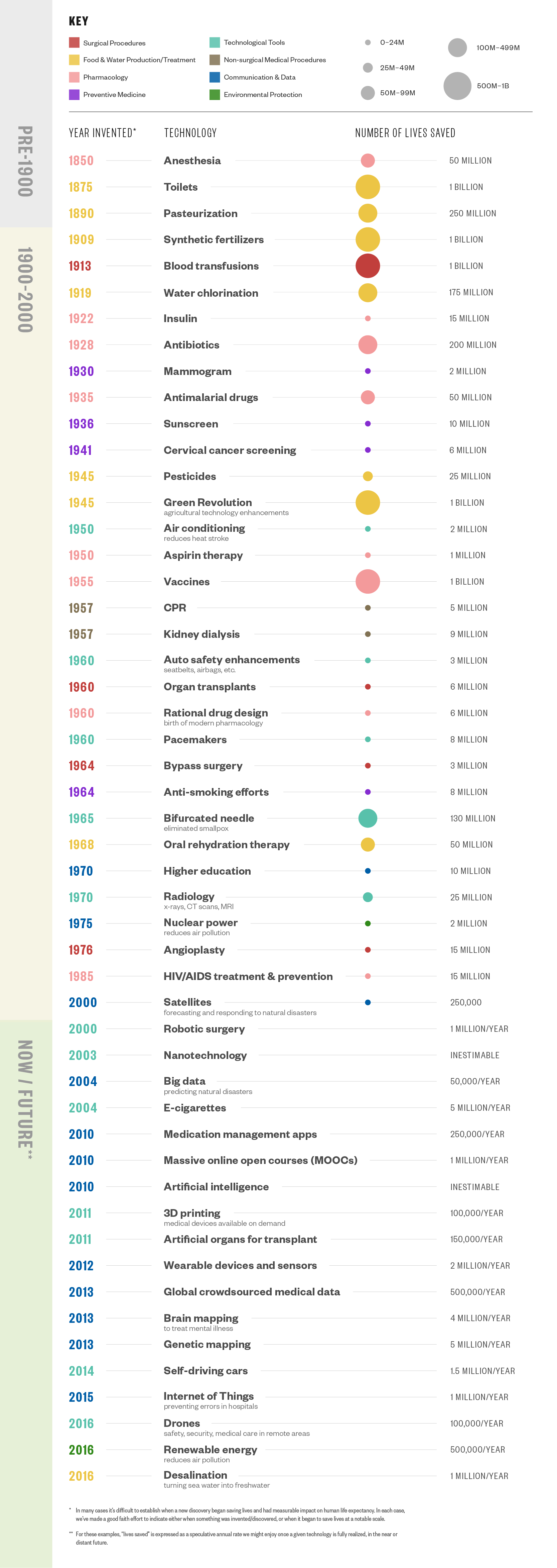
A timeline version of the chart with items arranged according to when they were invented was also designed as a supplementary reference for the radial chart.